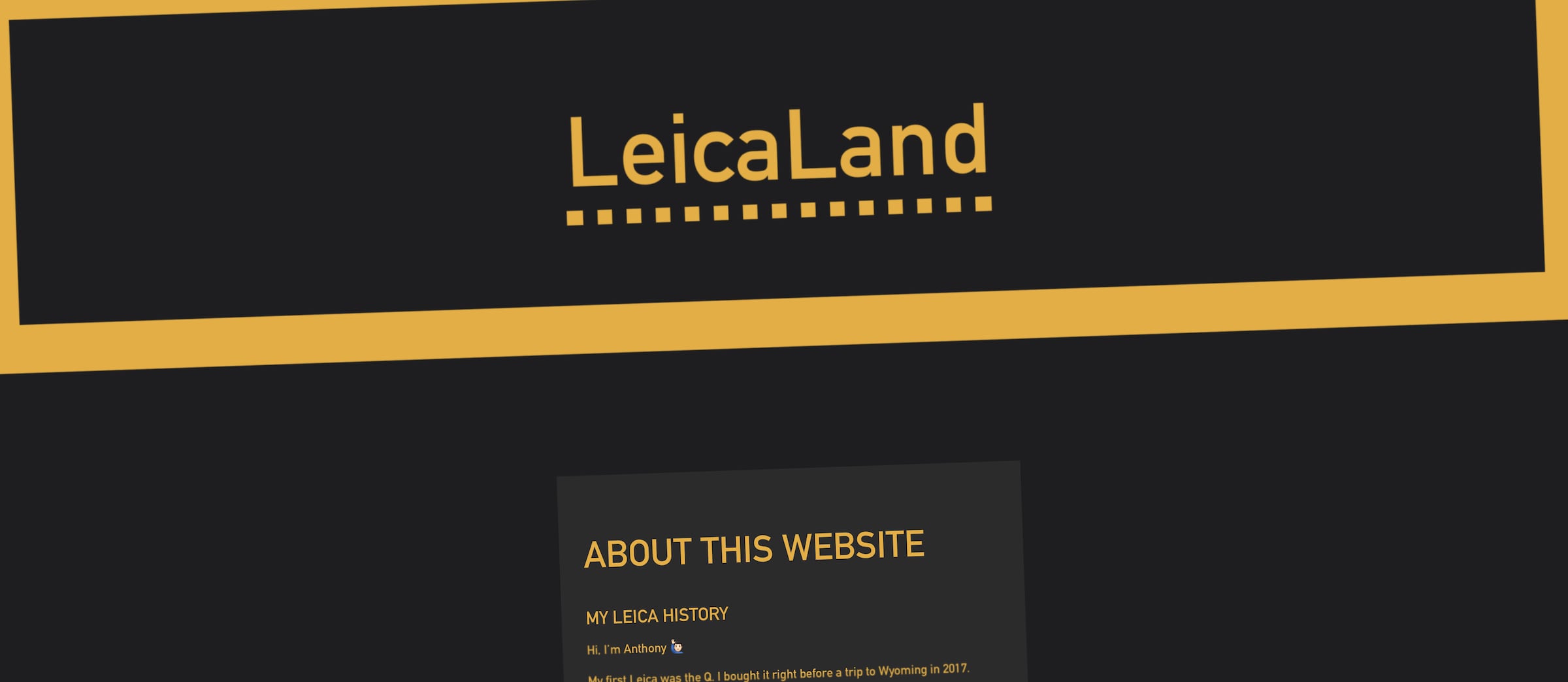
This was a fun one. I tried to track down the font Leica uses, but it's proprietary. I found a close alternative, DIN 1451, which has an interesting history.
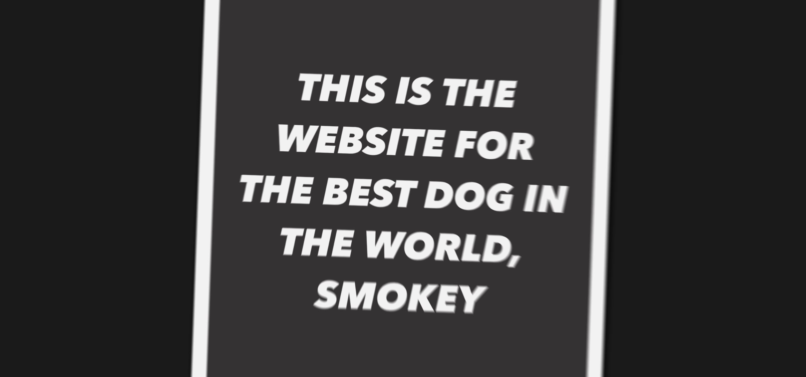
Just like in this portfolio page, I used a lot of gray in Smokey's website because I wanted him to be the shining star 🌟
It's pretty lightweight page overall, because the animations are just vanilla CSS3 (compiled from SCSS). I even remembered how to use discovered the box-sizing CSS property! 😆
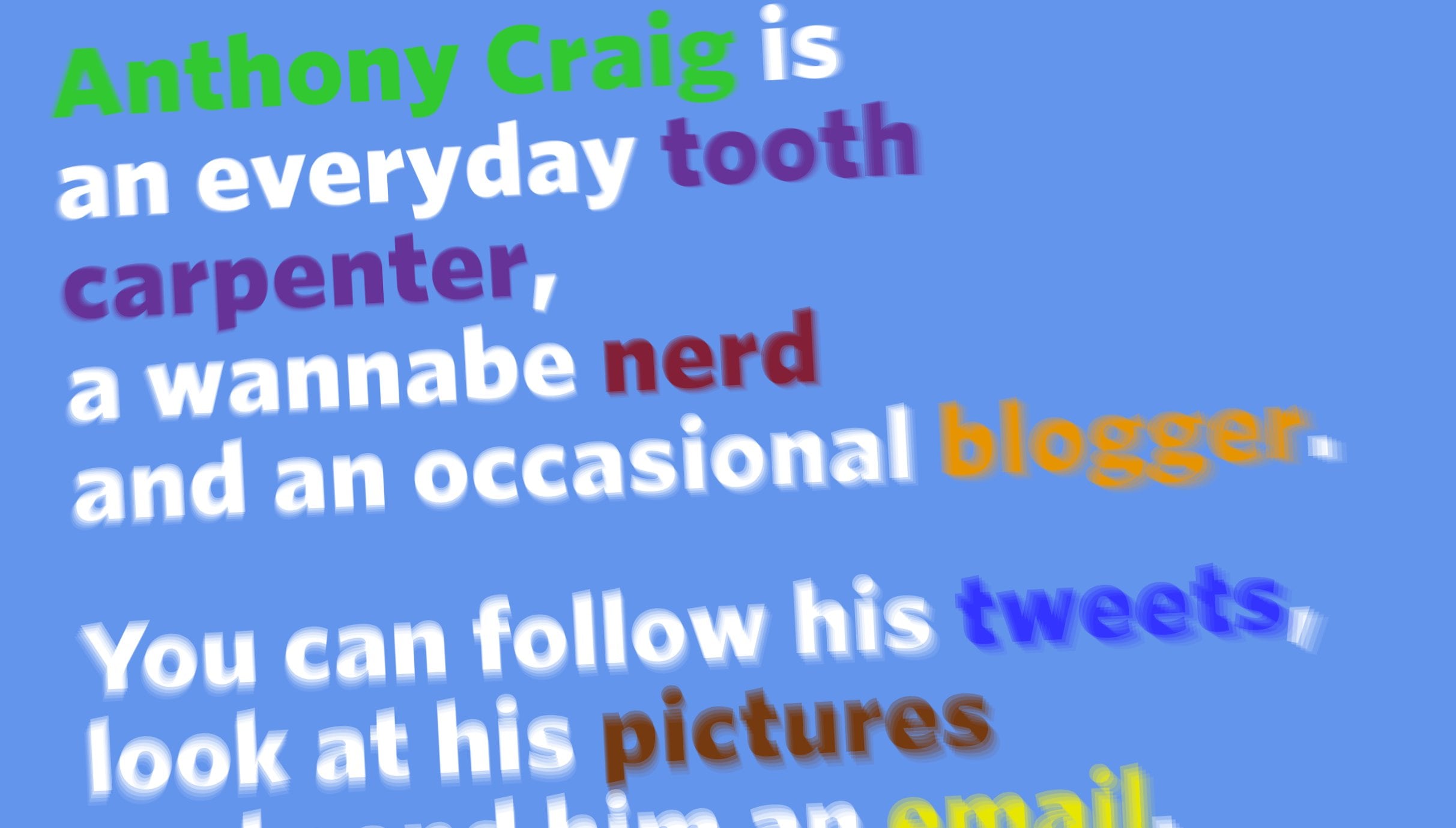
[You've seen this one already 😅] As you can see, I used bright colors for my personal website. I think it evokes a sense of playfulness. There's lots of display: flex; in order to easily center the body copy in their content containers. Also, I threw in plenty of fun animations to make everything feel alive.
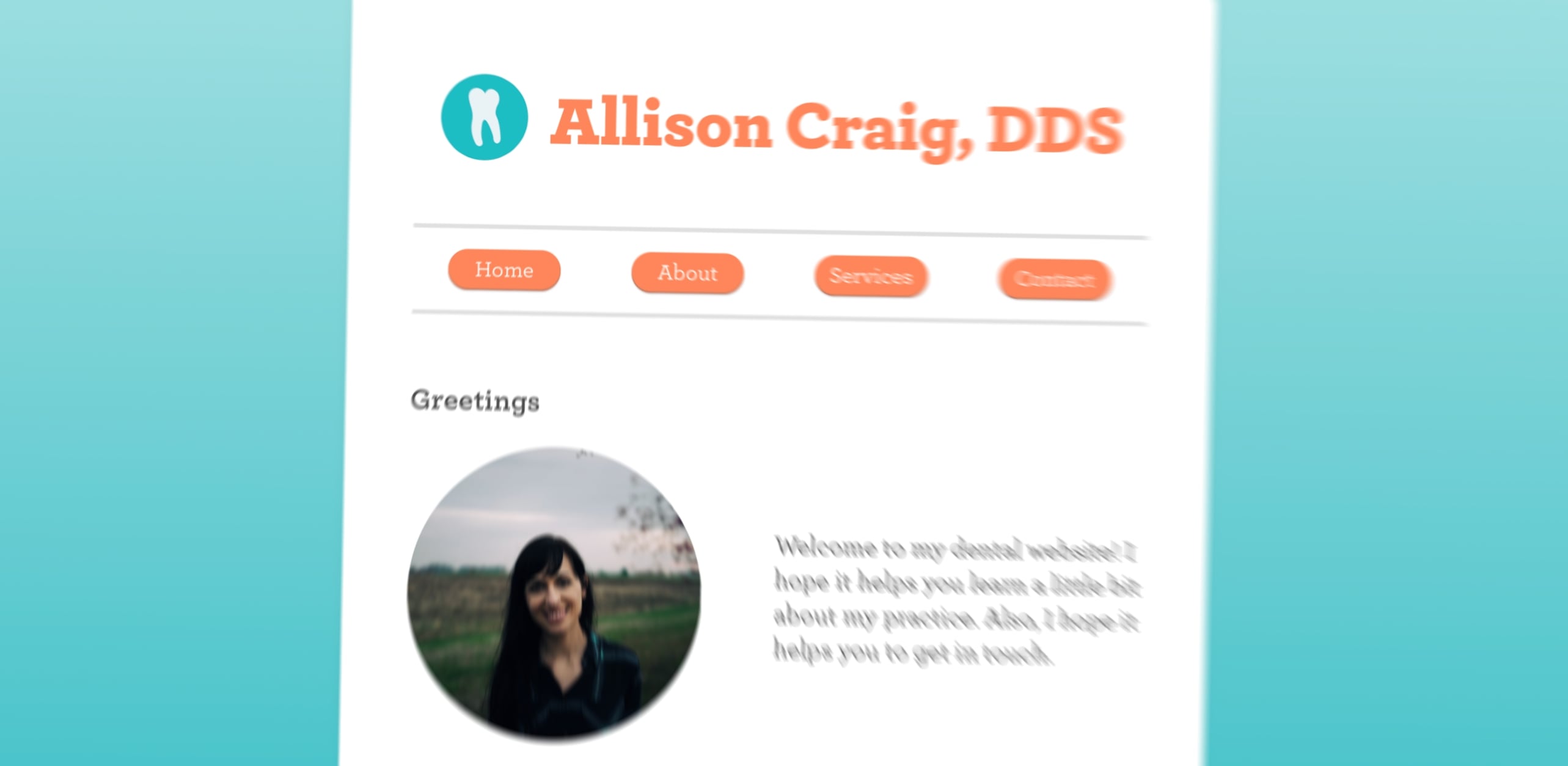
This is a dental website that's super quirky and cutesy 💁🏻 The skeumorphic touches were meant to evoke a sense of “old soul.” This design is unabashedly Allison. I'm not terribly fond of using background: linear-gradient();, but it adds a sense of modernity without upsetting the site's inherent skeumorphic notions.
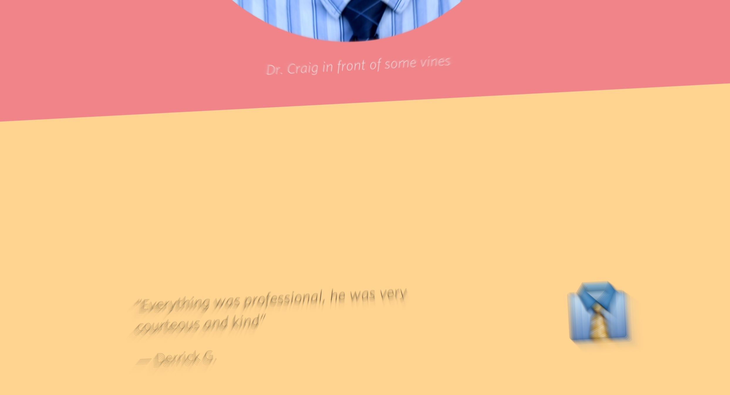
I wanted my dental website to be unconventional. You know—devoid of tooth glyphs and corny stock images of people with super white teeth (though there's nothing wrong with white teeth!). The contrasting bands of color were inspired by the visible light spectrum. Nerd first, dentist second.
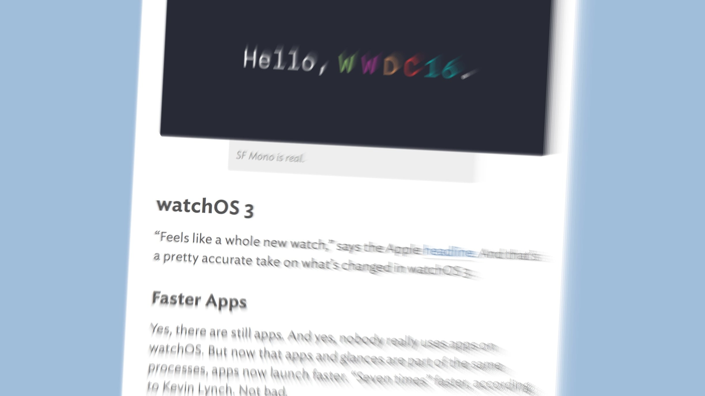
This blog was my first from-scratch design. No traditional CMS was used. (Welcome to the static-ish world of the web circa 1997 👴🏿) Naturally, the logo was inspired by my four-legged companion. It's been through several refactor's, mostly as I've picked up new skills like Node.js, Sass, and Jade Pug.